


is an app that offers both e-commerce and e-hailing platform.
This website is designed to showcase the details of these services and guide potential users to the product.
Overview
Product Live website & mobile app
Role Ui/ UX Designer + brand designer
Duration 2 months
Year 2024
Team Ui/ UX Designer, Product manager, CMO, IT team
Tools Figma, Adobe Photoshop, Adobe Illustrator
Design approach
Marketing
-
showcase the offered services
-
provide access to the services offered
Visual
-
represent company branding - gold metal
-
clear wayfinding of the navigation
-
functional and simple design interface
Adaptability
-
adapt to variety screen size and device type (website and mobile view)
Target users
-
users
-
partners
Design process
Research
Design development
Design production
Live
-
Study design brief
-
Precedent study
-
Prepare design options- wireframe
-
Presentation to product and managemant
-
Design revision
-
Presentation to IT team
-
Developers develop the website in Wordpress
-
Design revision
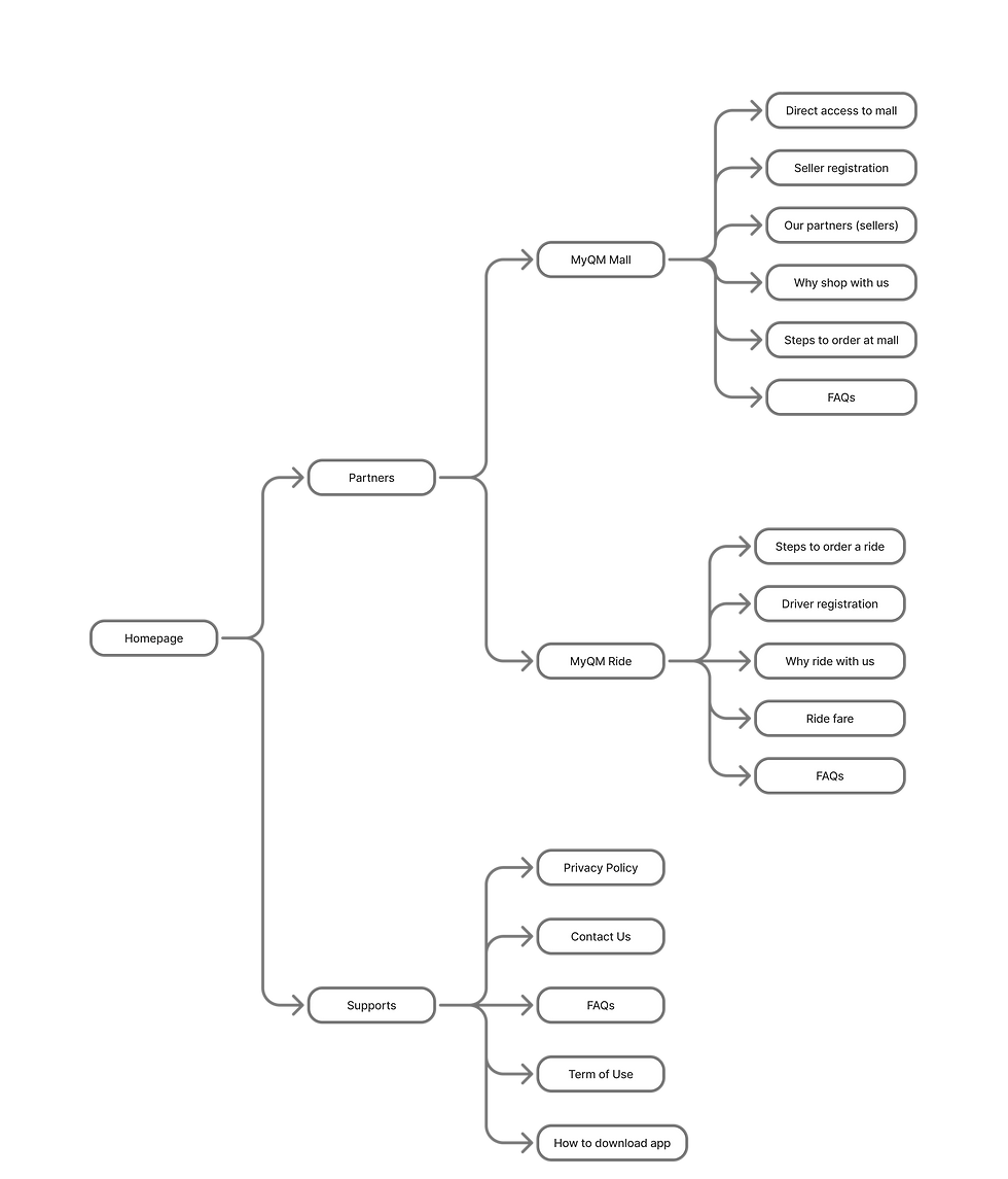
Information architecture
Competitive analysis


The references targeted are apps that offer services similar in nature to MyQM. These include:
-
Apps offering multiple services within a single platform:
-
Grab (Malaysia)
-
-
E-hailing & e-commerce platforms:
-
E-hailing: Grab (Malaysia), Uber, Gojek (overseas)
-
E-commerce: Tokopedia (overseas)
-
-
Websites with simple design and clear wayfinding
Grab and Gojek are the main references, as their approach to offering multiple services through a single app closely aligns with MyQM. Despite the variety of services, their navigation remains intuitive and user-friendly. The balance between whitespace and information, along with the strategic use of branding colors, helps users easily understand the services provided while reinforcing the brand identity.
Additionally, the well-placement of images and graphics act as visual breaks to prevent users from feeling overwhelmed by too much information.
The choice of visuals also contributes to emotional engagement. While photographs create a lively and relatable atmosphere, illustrations or cartoons, though modern and futuristic, can sometimes feel emotionally detached. For this project, we chose photographs with human figures to foster a stronger connection with the user.
Branding
Gold metal embodies the company's branding, symbolizing wealth, power, and exclusivity. Its reflective nature naturally draws attention, representing wisdom, luxury, and success in color psychology.
The sleek nature of polished gold conveys elegance, reflected in the fluidity of elements. Smooth curves combined with simple geometric lines define the main design language, applied to fonts, icons, and other design elements.
Colours

Primary - Gold
Gradient #E6C86A

Neutral - white
#ffffff

Primary - Gold (Plain)
#dbaa55

Neutral - light grey
#c4c4c4

Primary - Gold (Plain)
#dbaa55

Neutral - dark grey
#7e7e7e

Tertiary - Dope black
#2d2f34

Neutral - black
#111111
Font
Poppins
Light
Medium
Bold
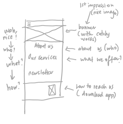
Wireframes
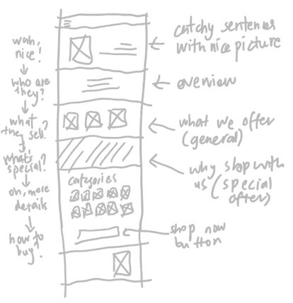
#1 Homepage
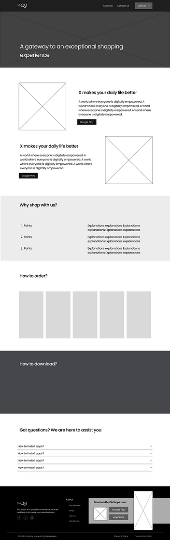
#2 e-commerce
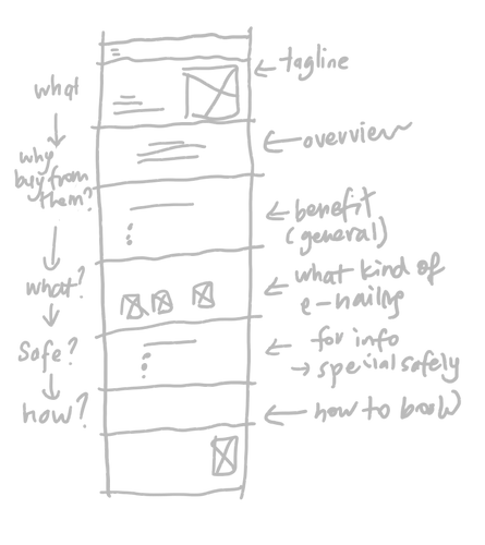
#3 e-hailing

Design features
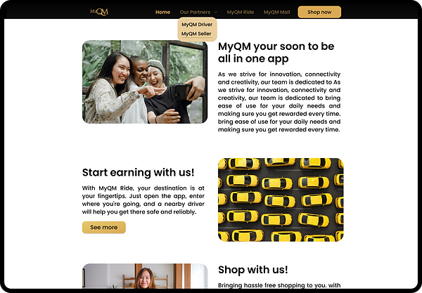
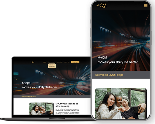
Overview of the services offered by MyQM App
At homepage, users will be able to view an overview of the services offered, which include e-commerce and e-hailing. Buttons are provided to direct users to the respective product pages.
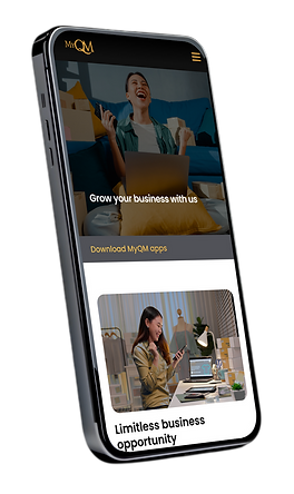
Link to MyQM Mall and Seller Registration page
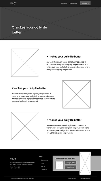
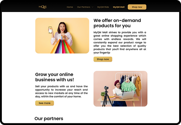
Users can learn more about the product on this page. By clicking the "Shop Now" button, they will be directed to the MyQM Mall page to start shopping.
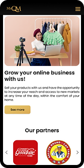
Potential sellers can click the
"See More" button to proceed to the Seller Registration page.


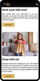
MyQM Ride booking process and safety features
Users will be able to view an overview of the services offered, which include e-commerce and e-hailing. Buttons are provided to direct users to the respective product pages.
